The continued pressure on the oil sector is wreaking havoc on the Canadian dollar. This morning, the Loonie continued its freefall by losing another -1.1% , bringing the current exchange-rate to US$0.69. It’s the first time the Canadian dollar has traded below US$0.70 in 13 years, but the damage could be even worse. David Doyle, a top forecaster for Macquarie Capital Markets, lowered his projection for 2016 to have the loonie finish at US$0.59. This would eclipse the all-time low for Canadian dollar, which was set on Jan 21, 2002, at just below US$0.62.
“Lower for Longer”
In this week’s chart, we show the well-established relationship between the Canadian dollar and the price of oil. Both prices have moved in tandem since 2000, and they’ve also both nosedived since the collapse of oil prices in mid-2014. In fact, it may not surprise you to know that there are traders out there who use the Canadian dollar as a proxy for oil prices. If they think oil is going lower, they’ll sell Canadian dollars if it offers them the right kind of market exposure. Oil is now trading at its lowest price since 2004, and many analysts believe that the pressure on prices will continue. Pundits are talking $20 oil and even $10 oil. While it’s very possible neither of those thresholds are reached, what is known is that low oil prices mean the Canadian dollar will continue to be under duress. However, what are the specifics of this relationship? Canada is surely an economy that has a heavier reliance on raw materials, but it is no Saudi Arabia, right?
The Relationship Between Oil and the Canadian Dollar
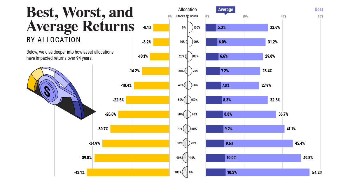
The key to this relationship is based on two major principles. Firstly, while Canada is a major producer of oil, it also exports the majority of this production to the United States. In 2014, Canada produced 4.4 million barrels of oil and equivalents per day, and it exported 3.4 million of this to the United States. Billions of US dollars are changing hands between American buyers and Canadian producers. Oil prices are mostly traded in US dollars, which means that as the price drops, there are less US dollars being paid out to Canadian producers. This means producers are exchanging fewer US dollars for the Canadian dollars they need to pay wages and production costs. This drops the amount of “demand” for Canadian dollars, which affects the price of the currency. Lastly, because oil is denominated in US dollars, the above effect gets further amplified by any other changes to the USD/CAD relationship. For example, while Canada has been loosening its monetary policy, the United States has been trying to do the opposite. This, along with other factors, has led to strength in the US dollar. A strong dollar means cheaper oil. Cheaper oil means lower demand for Canadian dollars. on Last year, stock and bond returns tumbled after the Federal Reserve hiked interest rates at the fastest speed in 40 years. It was the first time in decades that both asset classes posted negative annual investment returns in tandem. Over four decades, this has happened 2.4% of the time across any 12-month rolling period. To look at how various stock and bond asset allocations have performed over history—and their broader correlations—the above graphic charts their best, worst, and average returns, using data from Vanguard.
How Has Asset Allocation Impacted Returns?
Based on data between 1926 and 2019, the table below looks at the spectrum of market returns of different asset allocations:
We can see that a portfolio made entirely of stocks returned 10.3% on average, the highest across all asset allocations. Of course, this came with wider return variance, hitting an annual low of -43% and a high of 54%.
A traditional 60/40 portfolio—which has lost its luster in recent years as low interest rates have led to lower bond returns—saw an average historical return of 8.8%. As interest rates have climbed in recent years, this may widen its appeal once again as bond returns may rise.
Meanwhile, a 100% bond portfolio averaged 5.3% in annual returns over the period. Bonds typically serve as a hedge against portfolio losses thanks to their typically negative historical correlation to stocks.
A Closer Look at Historical Correlations
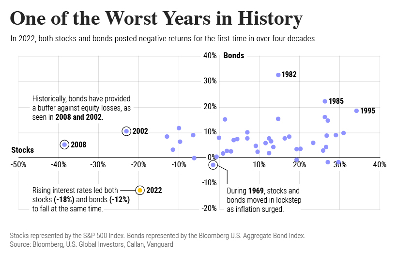
To understand how 2022 was an outlier in terms of asset correlations we can look at the graphic below:
The last time stocks and bonds moved together in a negative direction was in 1969. At the time, inflation was accelerating and the Fed was hiking interest rates to cool rising costs. In fact, historically, when inflation surges, stocks and bonds have often moved in similar directions. Underscoring this divergence is real interest rate volatility. When real interest rates are a driving force in the market, as we have seen in the last year, it hurts both stock and bond returns. This is because higher interest rates can reduce the future cash flows of these investments. Adding another layer is the level of risk appetite among investors. When the economic outlook is uncertain and interest rate volatility is high, investors are more likely to take risk off their portfolios and demand higher returns for taking on higher risk. This can push down equity and bond prices. On the other hand, if the economic outlook is positive, investors may be willing to take on more risk, in turn potentially boosting equity prices.
Current Investment Returns in Context
Today, financial markets are seeing sharp swings as the ripple effects of higher interest rates are sinking in. For investors, historical data provides insight on long-term asset allocation trends. Over the last century, cycles of high interest rates have come and gone. Both equity and bond investment returns have been resilient for investors who stay the course.
