Given the economic pressures of today’s world, these alternative housing solutions have become not only a viable option for many people, but a vital one. Today’s infographic from Calculator.me illustrates how the tiny home market got so big, and how it fares against traditional housing when it comes to providing environmentally friendly and affordable options.
How Did Tiny Homes Get So Big?
It was not until the 2009 recession hit the U.S. that tiny homes became more of a realistic option, as the benefits of downscaling became more apparent. From then on, three things propelled the popularity of tiny homes: rising house costs, shrinking incomes, and a greater consideration for the environment. Today, 63% of U.S. millennials would consider living in a tiny home. However, the need to go tiny is not only confined to millennials, as 40% of tiny home owners are over fifty years old.
Tiny Vs. Traditional
According to the infographic, a home is considered tiny (or micro) when it is between 80-400ft², and is at least 8ft in height. Tiny homes also come with a tiny pricetag, costing just $23,000 on average to build—meaning tiny homes are almost ⅒ the price of traditional homes. Other benefits of tiny home living include:
Avoiding mortgage debt Less maintenance required Allows for a more flexible lifestyle
Further, tiny homes are providing people with alternative solutions for more sustainable living.
An Environmentally Friendly Way of Living
Certain models of tiny homes use energy from solar panels—presenting ample opportunities for an independent off-grid lifestyle. Moreover, research from Virginia Tech shows that living in tiny homes reduces energy consumption by up to 45%. Using less energy can also be attributed to tiny homeowners using the space outside as an extension of their home. In fact, when there is usable space available outdoors, tiny home living may not seem as drastic in comparison to living in a traditional home.
Room For Improvement
There are however, some challenges for those who are considering this way of life. Zoning laws and building codes in the U.S. can be restrictive, with some states more supportive of the idea than others. Despite these barriers, there are numerous organizations and initiatives that have been created in order to eliminate the pain points that come with tiny homes, and legitimize the industry.
Not Just a Passing Trend
With the promising trajectory of tiny homes, it is inevitable that the interest from global retailers continues to grow. Japanese minimalist company, Muji, released their own tiny homes in 2017, costing $26,000 on average. At just under 107.6 ft², these tiny homes are prefabricated, meaning they are constructed in a factory off-site.
The Future Comes in All Shapes and Sizes
Beyond the typical tiny home formats we see entering the market en masse, there are other alternatives which will become more readily available to consumers, including:
Traditional modular homes Shipping containers 3D printed houses Recreational vehicles
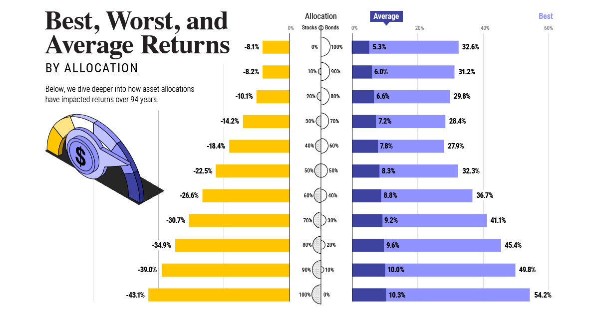
It is also worth pointing out that tiny homes and these alternative models don’t have to be restricted to under 400ft². Flat packs and do-it-yourself tiny homes can be as big as 1,000ft², with some of the largest models housing up to 24 people. It is clear that the tiny home movement is not just about going back to basics, but rather, about making home ownership a reality for everyone—potentially disrupting the current housing market in the process. The question is not if tiny homes will become the new normal, but when. on Last year, stock and bond returns tumbled after the Federal Reserve hiked interest rates at the fastest speed in 40 years. It was the first time in decades that both asset classes posted negative annual investment returns in tandem. Over four decades, this has happened 2.4% of the time across any 12-month rolling period. To look at how various stock and bond asset allocations have performed over history—and their broader correlations—the above graphic charts their best, worst, and average returns, using data from Vanguard.
How Has Asset Allocation Impacted Returns?
Based on data between 1926 and 2019, the table below looks at the spectrum of market returns of different asset allocations:
We can see that a portfolio made entirely of stocks returned 10.3% on average, the highest across all asset allocations. Of course, this came with wider return variance, hitting an annual low of -43% and a high of 54%.
A traditional 60/40 portfolio—which has lost its luster in recent years as low interest rates have led to lower bond returns—saw an average historical return of 8.8%. As interest rates have climbed in recent years, this may widen its appeal once again as bond returns may rise.
Meanwhile, a 100% bond portfolio averaged 5.3% in annual returns over the period. Bonds typically serve as a hedge against portfolio losses thanks to their typically negative historical correlation to stocks.
A Closer Look at Historical Correlations
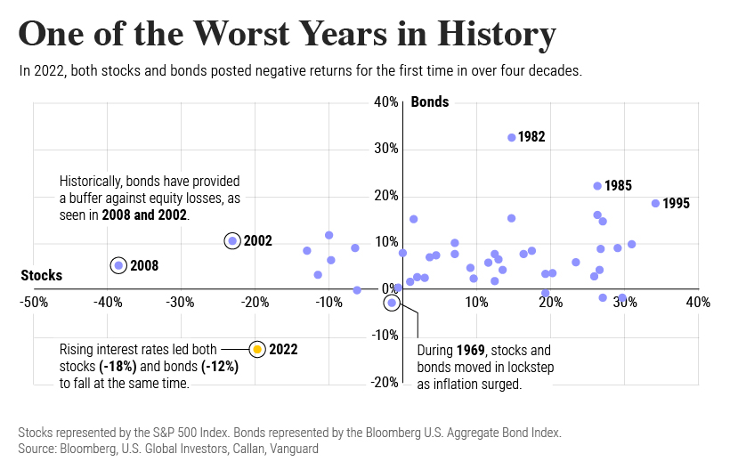
To understand how 2022 was an outlier in terms of asset correlations we can look at the graphic below:
The last time stocks and bonds moved together in a negative direction was in 1969. At the time, inflation was accelerating and the Fed was hiking interest rates to cool rising costs. In fact, historically, when inflation surges, stocks and bonds have often moved in similar directions. Underscoring this divergence is real interest rate volatility. When real interest rates are a driving force in the market, as we have seen in the last year, it hurts both stock and bond returns. This is because higher interest rates can reduce the future cash flows of these investments. Adding another layer is the level of risk appetite among investors. When the economic outlook is uncertain and interest rate volatility is high, investors are more likely to take risk off their portfolios and demand higher returns for taking on higher risk. This can push down equity and bond prices. On the other hand, if the economic outlook is positive, investors may be willing to take on more risk, in turn potentially boosting equity prices.
Current Investment Returns in Context
Today, financial markets are seeing sharp swings as the ripple effects of higher interest rates are sinking in. For investors, historical data provides insight on long-term asset allocation trends. Over the last century, cycles of high interest rates have come and gone. Both equity and bond investment returns have been resilient for investors who stay the course.
