For serious investors, the foundation of the discipline is to understand the properties of these individual components, and to have them work in harmony to achieve a specific portfolio goal. To do this successfully, one must understand the breadth of asset classes, tactics, and categories of investments that exist – and to know how they relate to one another.
The Chemicals Between Us
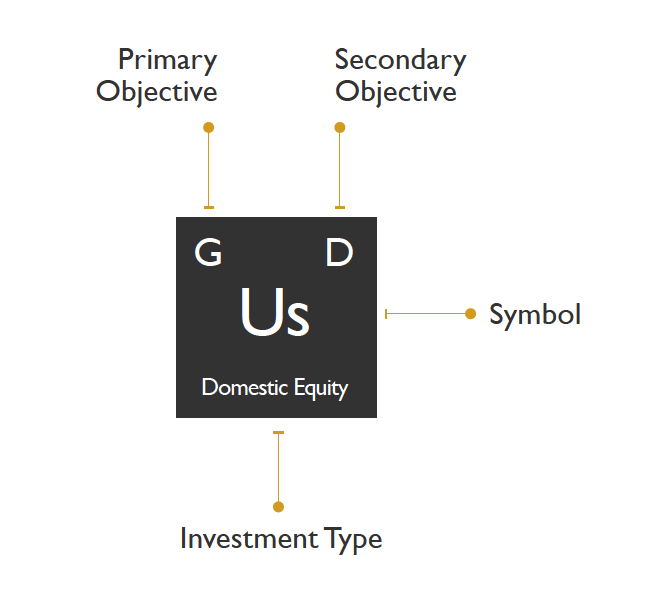
Today’s infographic comes from Phil Huber, the Chief Investment Officer for Huber Financial Advisors, who has cleverly depicted this relationship graphically in his blog. Similar to how the physical universe is made up of chemical elements, he sees the possibilities around portfolio management as drawing from a broad pool of investing “elements”. Combine these different elements together, and you get compounds, structures, and eventually entire funds. The periodic table of investments created by his team denotes each type of investment, the primary and secondary strategy related to it, and a color classification:
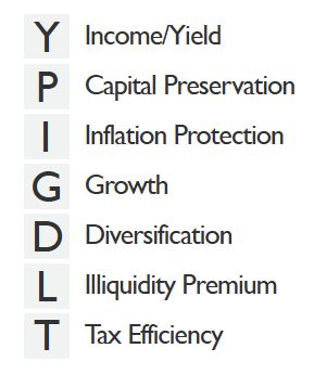
Here are the seven objectives that the top letters on each box refer to:
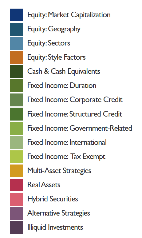
And finally, here are the colors that each block on the periodic table correspond to:
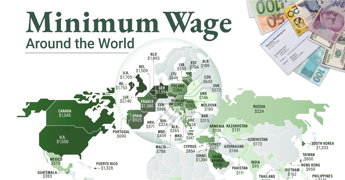
As you can see, considerable thought has been put into the categories and classifications. However, as Phil notes, this is simply the opinion of one person and it is not intended to be a universally accurate depiction of all portfolio management wisdom that exists: Phil Huber, Chief Investment Officer For more of the lessons that can be derived from this clever periodic table of investments, we suggest checking out the original post on Huber’s blog. Is there anything that he missed, or that you think could be classified better? on To see how the minimum wage differs around the world, we’ve visualized data from Picodi, which includes values for 67 countries as of January 2023.
Monthly Minimum Wage, by Country
The following table includes all of the data used in this infographic. Each value represents the monthly minimum wage a full-time worker would receive in each country. Picodi states that these figures are net of taxes and have been converted to USD. Generally speaking, developed countries have a higher cost of living, and thus require a higher minimum wage. Two outliers in this dataset are Argentina and Turkey, which have increased their minimum wages by 100% or more from January 2022 levels. Turkey is suffering from an ongoing currency crisis, with the lira losing over 40% of its value in 2021. Prices of basic goods have increased considerably as the Turkish lira continues to plummet. In fact, a 2022 survey found that 70% of people in Turkey were struggling to pay for food. Argentina, South America’s second-biggest economy, is also suffering from very high inflation. In response, the country announced three minimum wage increases throughout 2022.
Minimum Wage in the U.S.
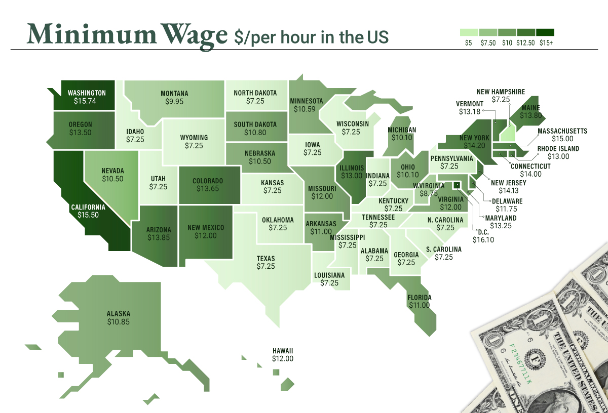
Within the U.S., minimum wage varies significantly by state. We’ve visualized each state’s basic minimum rate (hourly) using January 2023 data from the U.S. Department of Labor.
2023-03-17 Update: This map was updated to fix several incorrect values. We apologize for any confusion this may have caused. America’s federal minimum wage has remained unchanged since 2009 at $7.25 per hour. Each state is allowed to set their own minimum wage, as long as it’s higher than the federal minimum. In states that do not set their own minimum, the federal minimum applies. If we assume someone works 40 hours a week, the federal minimum wage of $7.25 translates to an annual figure of just $15,080 before taxes. California’s minimum wage of $15.50 translates to $32,240 before taxes. For further perspective, check out our 2022 infographic on the salary needed to buy a home across 50 U.S. cities.
