No matter your system of government, the public sector plays a vital role in establishing your economic mobility and political freedoms. Measuring corruption—the abuse of power for private gain—reveals how equal a system truly is. For more than a decade, the Corruption Perceptions Index (CPI) by Transparency International has been the world’s most widely-used metric for scoring corruption. This infographic uses the 2021 CPI to visualize corruption in countries around the world, and the biggest 10-year changes.
Which Countries are Most (and Least) Corrupt?
How do you measure corruption, which includes behind-the-scenes deals, nepotism, corrupt prosecution, and bribery? Over the last few decades, the CPI has found success doing so indirectly through perceptions. By aggregating multiple analyses from country and business experts, the index assigns each country a score on a scale of 0 to 100, where 0 is highly corrupt and 100 is very clean. Here are the results of the 2021 CPI, with the least corrupt countries at the top: Ranking at the top of the index with scores of 88 are Nordic countries Denmark and Finland, as well as New Zealand. They’ve consistently topped the CPI over the last decade, and Europe in general had 14 of the top 20 least corrupt countries. Asia also had many notable entrants, including Singapore (tied for #4), Hong Kong (#12), and Japan (tied for #18). Comparatively, the Americas only had two countries score in the top 20 least corrupt: Canada (tied for #13) and Uruguay (tied for #18). With a score of 67, the U.S. scored at #28 just behind Bhutan, the UAE, and France. Scoring towards the bottom of the index were many countries currently and historically going through conflict, primarily located in the Middle East and Africa. They include Afghanistan, Venezuela, Somalia, and South Sudan. The latter country finishes at the very bottom of the list, with a score of just 11.
How Corruption in Countries Has Changed (2012–2021)
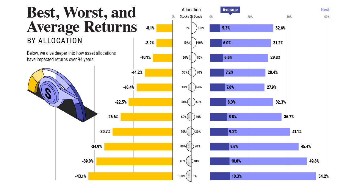
Corruption is a constant and moving global problem, so it’s also important to measure which countries have had their images improved (or worsened). By using CPI scores dating back to 2012, we can examine how country scores have changed over the last decade: The biggest climber with +18 was Seychelles, Africa’s smallest country and also its least corrupt with a score of 70. Other notable improvements include neighboring countries Estonia, Latvia, and Belarus, with Estonia rising into the top 15 least corrupt countries. On the opposite side, both Australia (-12) and Canada (-10) have actually fallen out of the top 10 least corrupt countries over the last decade. They’re joined by decreases in Hungary (-12) and Syria (-13), which is now ranked as the world’s second-most corrupt country. Which countries will rise and fall in corruption perceptions over the next 10 years, and how do your perceptions compare with this list? on Last year, stock and bond returns tumbled after the Federal Reserve hiked interest rates at the fastest speed in 40 years. It was the first time in decades that both asset classes posted negative annual investment returns in tandem. Over four decades, this has happened 2.4% of the time across any 12-month rolling period. To look at how various stock and bond asset allocations have performed over history—and their broader correlations—the above graphic charts their best, worst, and average returns, using data from Vanguard.
How Has Asset Allocation Impacted Returns?
Based on data between 1926 and 2019, the table below looks at the spectrum of market returns of different asset allocations:
We can see that a portfolio made entirely of stocks returned 10.3% on average, the highest across all asset allocations. Of course, this came with wider return variance, hitting an annual low of -43% and a high of 54%.
A traditional 60/40 portfolio—which has lost its luster in recent years as low interest rates have led to lower bond returns—saw an average historical return of 8.8%. As interest rates have climbed in recent years, this may widen its appeal once again as bond returns may rise.
Meanwhile, a 100% bond portfolio averaged 5.3% in annual returns over the period. Bonds typically serve as a hedge against portfolio losses thanks to their typically negative historical correlation to stocks.
A Closer Look at Historical Correlations
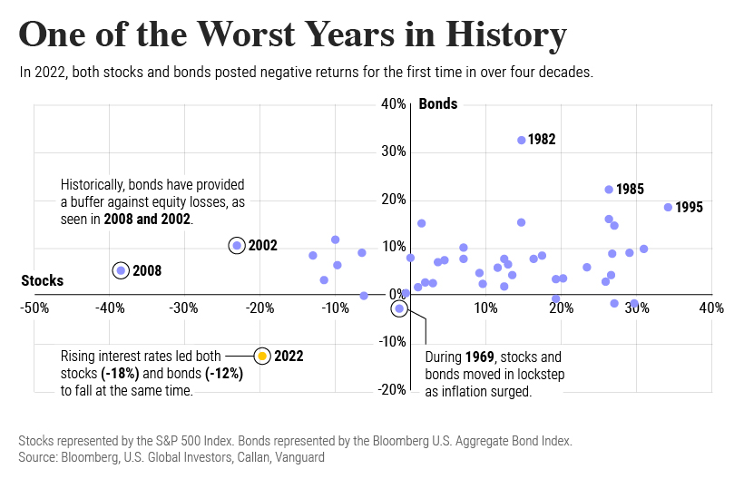
To understand how 2022 was an outlier in terms of asset correlations we can look at the graphic below:
The last time stocks and bonds moved together in a negative direction was in 1969. At the time, inflation was accelerating and the Fed was hiking interest rates to cool rising costs. In fact, historically, when inflation surges, stocks and bonds have often moved in similar directions. Underscoring this divergence is real interest rate volatility. When real interest rates are a driving force in the market, as we have seen in the last year, it hurts both stock and bond returns. This is because higher interest rates can reduce the future cash flows of these investments. Adding another layer is the level of risk appetite among investors. When the economic outlook is uncertain and interest rate volatility is high, investors are more likely to take risk off their portfolios and demand higher returns for taking on higher risk. This can push down equity and bond prices. On the other hand, if the economic outlook is positive, investors may be willing to take on more risk, in turn potentially boosting equity prices.
Current Investment Returns in Context
Today, financial markets are seeing sharp swings as the ripple effects of higher interest rates are sinking in. For investors, historical data provides insight on long-term asset allocation trends. Over the last century, cycles of high interest rates have come and gone. Both equity and bond investment returns have been resilient for investors who stay the course.
