Is there any truth to these claims, or is it superstitious nonsense? This infographic uses data gathered by Schroders, a British asset management firm, to investigate.
What the Data Says
This analysis is based on 31 years of performance across four major stock indexes:
FTSE 100: An index of the top 100 companies on the London Stock Exchange (LSE) MSCI World: An index of over 1,000 large and mid-cap companies within developed markets S&P 500: An index of the 500 largest companies that trade on U.S. stock exchanges Eurostoxx 50: An index of the top 50 blue-chip stocks within the Eurozone region
The percentages in the following table represent the historical frequency of these indexes rising in a given month, between the years 1987 and 2018. Months are ordered from best to worst, in descending order. There are some outliers in this dataset that we’ll focus on below.
The Strong Months
In terms of frequency of growth, December has historically been the best month to own stocks. This lines up with a phenomenon known as the “Santa Claus Rally”, which suggests that equity markets rally over Christmas. One theory is that the holiday season has a psychological effect on investors, driving them to buy rather than sell. We can also hypothesize that many institutional investors are on vacation during this time. This could give bullish retail investors more sway over the direction of the market. The second best month was April, which is commonly regarded as a strong month for the stock market. One theory is that many investors receive their tax refunds in April, which they then use to buy stocks. The resulting influx of cash pushes prices higher. Speaking of higher prices, we can also look at this trend from the perspective of returns. Focusing on the S&P 500, and looking back to 1928, April has generated an average return of 0.88%. This is well above the all-month average of 0.47%.
The Weak Months
The three worst months to own stocks, according to this analysis, are June, August, and September. Is it a coincidence that they’re all in the summer? One theory for the season’s relative weakness is that institutional traders are on vacation, similar to December. Without the holiday cheer, however, the market is less frothy and the reduced liquidity leads to increased risk. Whether you believe this or not, the data does show a convincing pattern. It’s for this reason that the phrase “sell in May and go away” has become popularized.
Key Takeaways
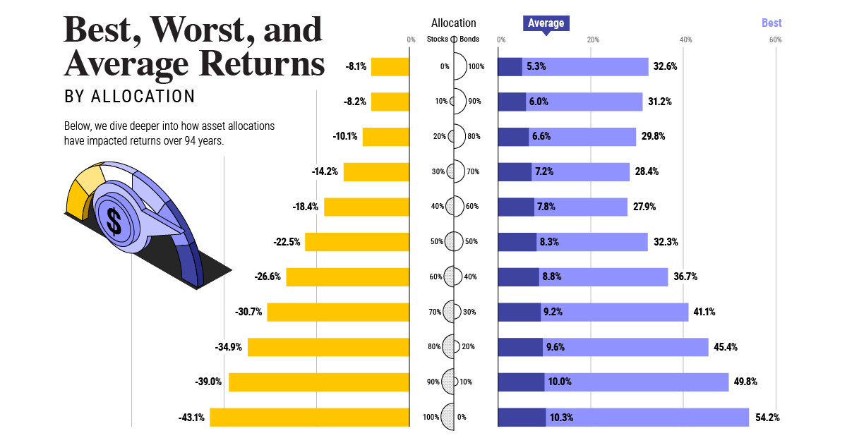
Investors should remember that this data is based on historical results, and should not be used to make forward-looking decisions in the stock market. Anomalies like the COVID-19 pandemic in 2020 can have a profound impact on the world, and the market as a whole. Stock market performance during these times may deviate greatly from their historical averages seen above. Regardless, this analysis can still be useful to investors who are trying to understand market movements. For example, if stocks rise in December without any clear catalyst, it could be the famed Santa Claus Rally at work. on Last year, stock and bond returns tumbled after the Federal Reserve hiked interest rates at the fastest speed in 40 years. It was the first time in decades that both asset classes posted negative annual investment returns in tandem. Over four decades, this has happened 2.4% of the time across any 12-month rolling period. To look at how various stock and bond asset allocations have performed over history—and their broader correlations—the above graphic charts their best, worst, and average returns, using data from Vanguard.
How Has Asset Allocation Impacted Returns?
Based on data between 1926 and 2019, the table below looks at the spectrum of market returns of different asset allocations:
We can see that a portfolio made entirely of stocks returned 10.3% on average, the highest across all asset allocations. Of course, this came with wider return variance, hitting an annual low of -43% and a high of 54%.
A traditional 60/40 portfolio—which has lost its luster in recent years as low interest rates have led to lower bond returns—saw an average historical return of 8.8%. As interest rates have climbed in recent years, this may widen its appeal once again as bond returns may rise.
Meanwhile, a 100% bond portfolio averaged 5.3% in annual returns over the period. Bonds typically serve as a hedge against portfolio losses thanks to their typically negative historical correlation to stocks.
A Closer Look at Historical Correlations
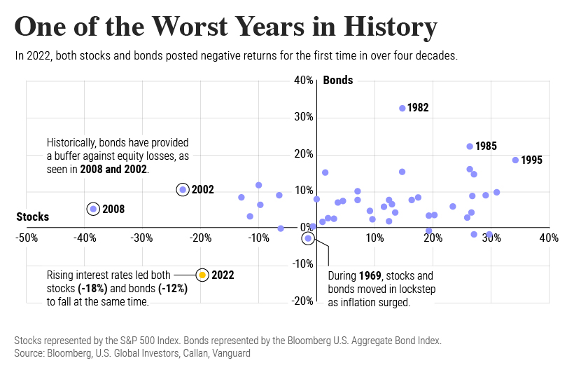
To understand how 2022 was an outlier in terms of asset correlations we can look at the graphic below:
The last time stocks and bonds moved together in a negative direction was in 1969. At the time, inflation was accelerating and the Fed was hiking interest rates to cool rising costs. In fact, historically, when inflation surges, stocks and bonds have often moved in similar directions. Underscoring this divergence is real interest rate volatility. When real interest rates are a driving force in the market, as we have seen in the last year, it hurts both stock and bond returns. This is because higher interest rates can reduce the future cash flows of these investments. Adding another layer is the level of risk appetite among investors. When the economic outlook is uncertain and interest rate volatility is high, investors are more likely to take risk off their portfolios and demand higher returns for taking on higher risk. This can push down equity and bond prices. On the other hand, if the economic outlook is positive, investors may be willing to take on more risk, in turn potentially boosting equity prices.
Current Investment Returns in Context
Today, financial markets are seeing sharp swings as the ripple effects of higher interest rates are sinking in. For investors, historical data provides insight on long-term asset allocation trends. Over the last century, cycles of high interest rates have come and gone. Both equity and bond investment returns have been resilient for investors who stay the course.


