By now, Walmart’s rise to the top of the retail pyramid is well documented. The Supercenters that dot the American landscape have had a dramatic ripple effect on surrounding communities, often resulting in decreased competition and reduced selection for consumers. Today, in some communities, Walmart takes in a whopping $19 for every $20 spent on groceries. Today’s map, based on a report from the Institute for Local Self-Reliance, looks at which places in America are most reliant on Walmart to put food on the table.
The Weight of Walmart
Walmart has an unprecedented amount of control over the food system, now capturing a quarter of every single dollar spent on groceries in the United States. Walmart isn’t just a major player — in some cases it’s become the only game in town. In a few of the communities listed in the report, Walmart commands a 90% market share and higher. Here’s a breakdown of the top 20 towns dominated by Walmart in America: While it’s more likely for a small town to become dominated by a single grocer, Walmart’s clout isn’t exclusive to rural America. Even in Springfield, Missouri — with a regional population of half a million people — the big box retailer still boasts a sizable market share of 66%.
Super Market Concentration
Under guidelines established by the Justice Department’s Antitrust Division, markets in which one corporation captures more than 50% of revenue are defined as “highly concentrated.” Walmart’s market share meets or exceeds this measure in 43 metropolitan areas and 160 smaller markets around the United States. In some states, this trend is even more pronounced. In Oklahoma, for example, 86% of the state’s population lives in a region where Walmart has the majority market share in the grocery sector. In Arkansas — the home state of the megaretailer — half the population lives in this “highly concentrated” grocery market situation. This degree of market concentration means that a retailer could cut certain products or manipulate prices without fear of losing customers. Worse yet, a company could close up shop and leave thousands of people without adequate grocery access.
An Interesting Caveat
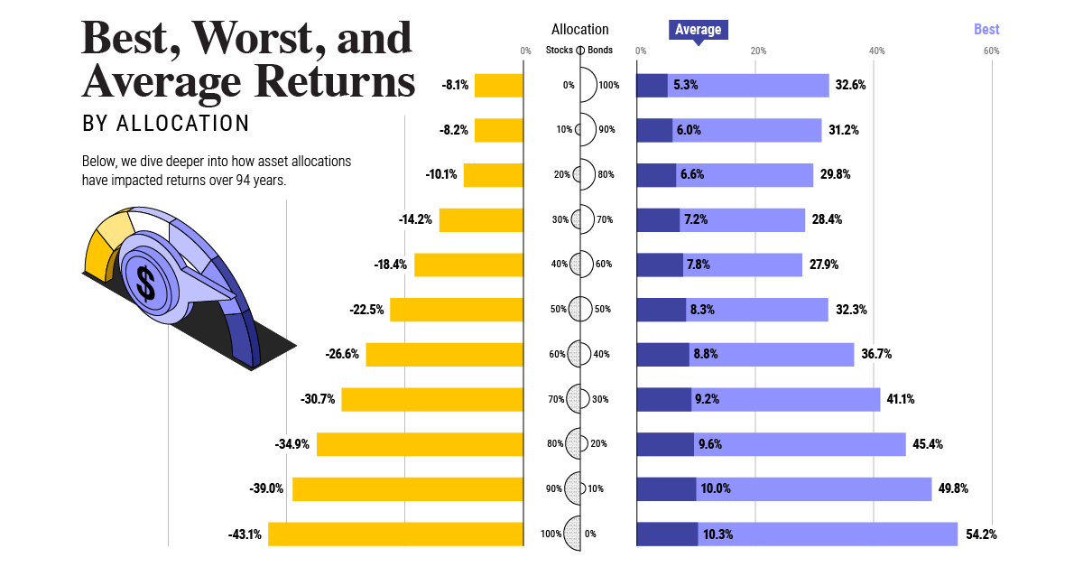
There is a flip side to this story, however. Walmart has shown a willingness to expand their grocery business to areas that were considered “food deserts” (i.e. low-income areas without easy access to a supermarket). In a 2011 initiative, the retailer committed to open or expand 1,500 supermarkets across America to help give more people access to fresh food. on Last year, stock and bond returns tumbled after the Federal Reserve hiked interest rates at the fastest speed in 40 years. It was the first time in decades that both asset classes posted negative annual investment returns in tandem. Over four decades, this has happened 2.4% of the time across any 12-month rolling period. To look at how various stock and bond asset allocations have performed over history—and their broader correlations—the above graphic charts their best, worst, and average returns, using data from Vanguard.
How Has Asset Allocation Impacted Returns?
Based on data between 1926 and 2019, the table below looks at the spectrum of market returns of different asset allocations:
We can see that a portfolio made entirely of stocks returned 10.3% on average, the highest across all asset allocations. Of course, this came with wider return variance, hitting an annual low of -43% and a high of 54%.
A traditional 60/40 portfolio—which has lost its luster in recent years as low interest rates have led to lower bond returns—saw an average historical return of 8.8%. As interest rates have climbed in recent years, this may widen its appeal once again as bond returns may rise.
Meanwhile, a 100% bond portfolio averaged 5.3% in annual returns over the period. Bonds typically serve as a hedge against portfolio losses thanks to their typically negative historical correlation to stocks.
A Closer Look at Historical Correlations
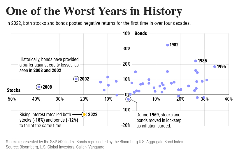
To understand how 2022 was an outlier in terms of asset correlations we can look at the graphic below:
The last time stocks and bonds moved together in a negative direction was in 1969. At the time, inflation was accelerating and the Fed was hiking interest rates to cool rising costs. In fact, historically, when inflation surges, stocks and bonds have often moved in similar directions. Underscoring this divergence is real interest rate volatility. When real interest rates are a driving force in the market, as we have seen in the last year, it hurts both stock and bond returns. This is because higher interest rates can reduce the future cash flows of these investments. Adding another layer is the level of risk appetite among investors. When the economic outlook is uncertain and interest rate volatility is high, investors are more likely to take risk off their portfolios and demand higher returns for taking on higher risk. This can push down equity and bond prices. On the other hand, if the economic outlook is positive, investors may be willing to take on more risk, in turn potentially boosting equity prices.
Current Investment Returns in Context
Today, financial markets are seeing sharp swings as the ripple effects of higher interest rates are sinking in. For investors, historical data provides insight on long-term asset allocation trends. Over the last century, cycles of high interest rates have come and gone. Both equity and bond investment returns have been resilient for investors who stay the course.
